skip to main |
skip to sidebar


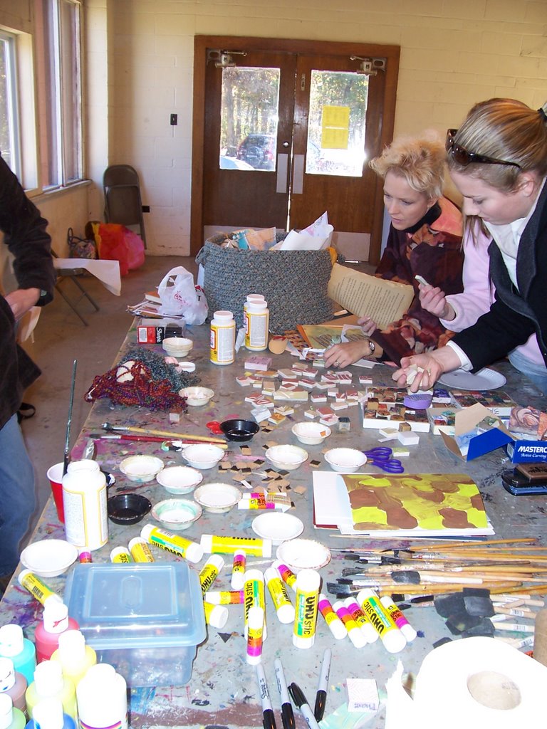
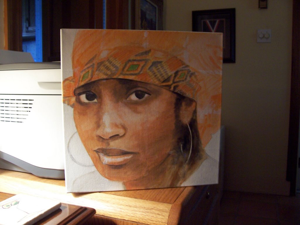
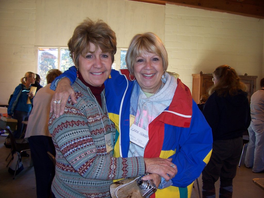
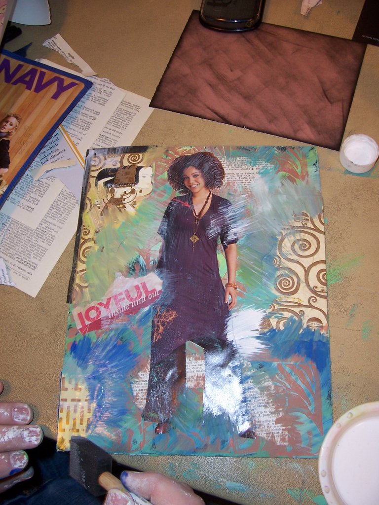
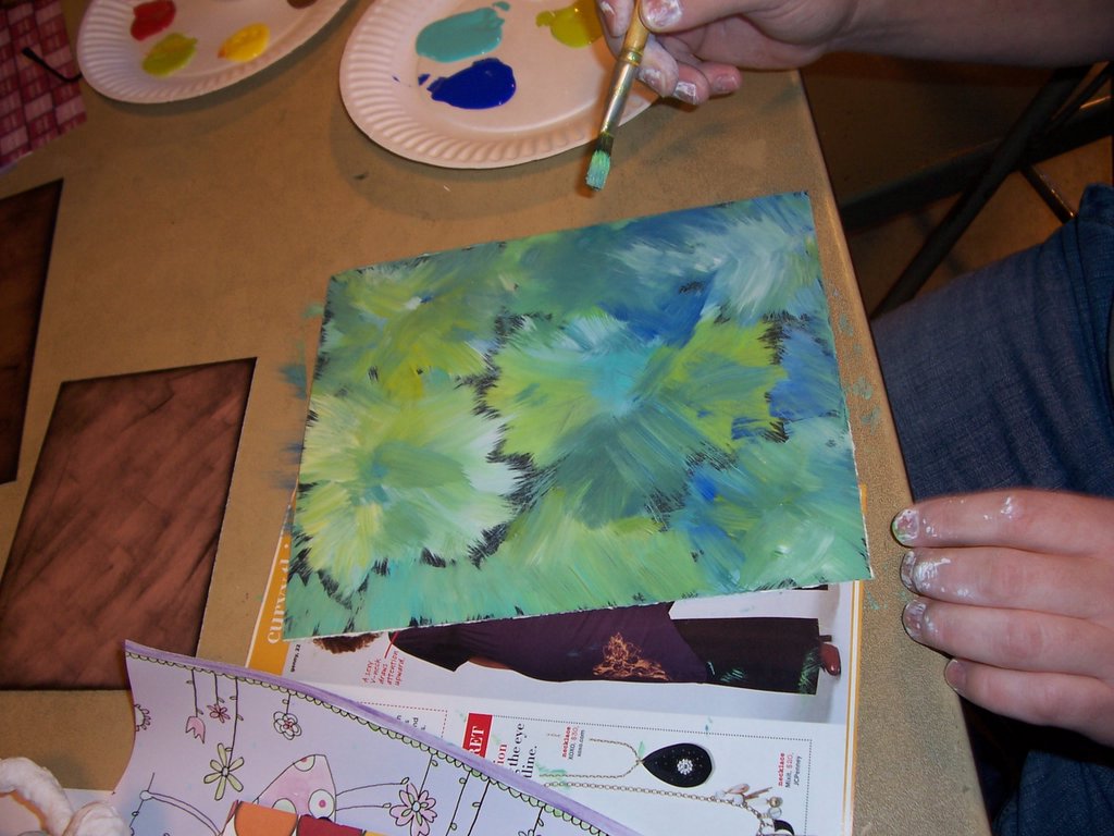
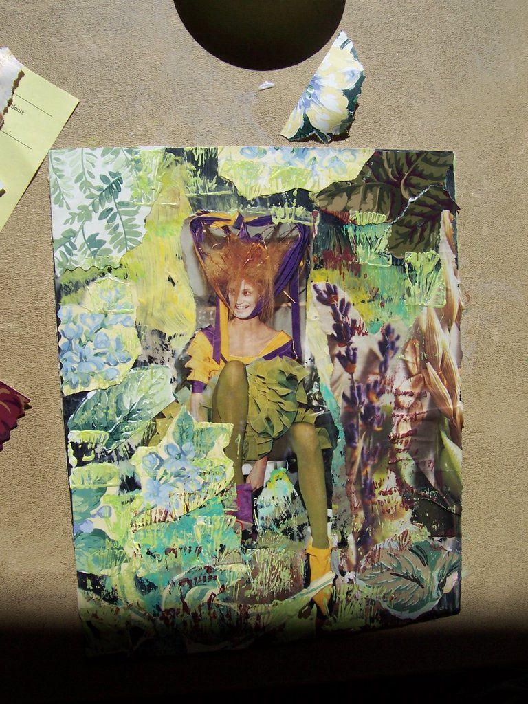
 Art WEekenD with my sis. It was filled with laughter, making art, antiqueing, and generally solving the worlds problems.... Our Collage workshop was fun for all, I think. We got some great results. We brought tons of stuff to create with, gave a few instructions, and then turned them loose. We had some fabulous results. Here are some of the backgrounds, and a few with focal points added. They turned out great, and everyone seemed inspired to continue this with their students when they get back to the classroom.Our travels took us to the little town of Blackwater, population 199, where we made a few friends, and enjoyed some antique shopping and bratwurst. What a fabulous weekend, love you, sis.......
 Getting farther along
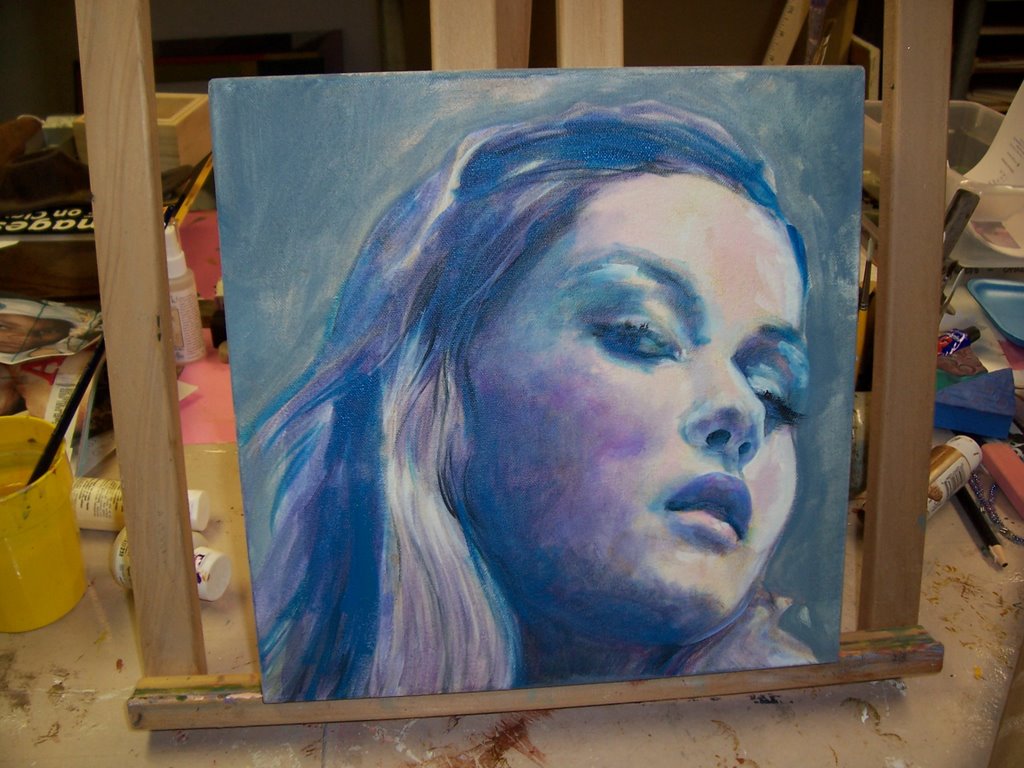
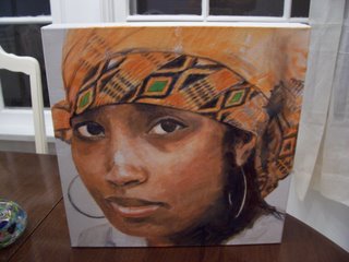
 New portrait, day 1:This is mainly glazes so far.... It's hard to find the exact look, do you want muted, or contrasted values?? I'm still not sure which.... If you only use glazes, it seems soft, but then again, I'm so used to having definate darks and lights that I can't seem to give up the high contrast.. which do you think is best??
 I've been looking at this too long. HELP- can anyone give me some constructive advice ?Do I need to change the background color? How about the values? enough contrast? Be honest and tell me what you think. I can't tell anymore, my eyes are weary...... thanks in advance!!